
Top 5 Archive — 04
What’s this?
Before our Tip 5 there was our Top 5. These are the archived pages from our 5 weekly hot tips from yesteryear.

1: Enchanting repetition.
Enchanting repetition.
Earlier this year, Páraic McGloughlin made a high-profile clip for the track Someday by Weval, somewhat on the same principle as his brother Kevin’s for Max Cooper: hypnotic mayhem. Are they actually brothers? Or are they alter egos? Anyway, be sure to check out their older films Epoch (by Kevin) and Arena (by Páraic). And then we also secretly slip this tip in, because it fits so nicely with the work of these boys. There also seems to be a brother called Pearson who makes music, but Google that info for yourself if you’re curious about it...

2: Dutchest design
Almost autumn, so quickly something very Summery in our top 5!
At the beginning of this month, Zundert exploded with awesomeness. We had not had the phenomenon of the flower parade very clearly in our sights for a number of years and were shocked when we saw how the flat farmers carts with displayed plants have evolved. Dutch design that cannot possibly be more Dutch than this.
At the beginning of this month, Zundert exploded with awesomeness. We had not had the phenomenon of the flower parade very clearly in our sights for a number of years and were shocked when we saw how the flat farmers carts with displayed plants have evolved. Dutch design that cannot possibly be more Dutch than this.
3: A grey past. In CMYK
Lovely series
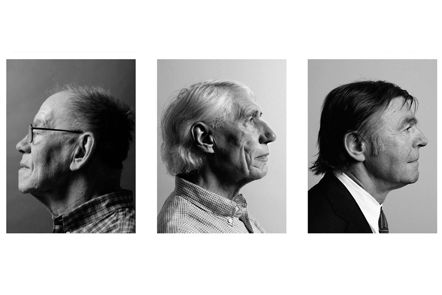
Publisher [Z]OO has been doing beautiful projects for years. This includes Graphic Roots, a series of publications on the roots of Dutch design in 50 portraits of many balding and gray designers with deeply grooved, wrinkled heads. Big absentee? The female gender. Only four portraits are of women… Comforting thought: the roots of Dutch graphic design may be one big sausagefest, but the standard bearers of contemporary Dutch design are really mainly women. That even for the record.
The modernist nestor Wim Crouwel, who died yesterday, is indispensable in this overview. Perhaps a bit morbid, but we secretly wonder whether Wim designed his tombstone himself. And whether he has chosen the Gridnik, New Alphabet or simply Helvetica as the font.
4: Speaking of fonts...
Delicious proofs!
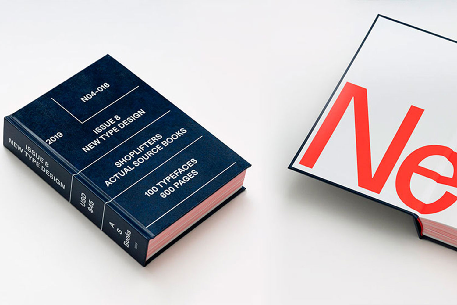
Letters, fonts, typefaces, serifs, sans, tasty grotesques, weird retro fonts, classy fonts… Yes, OK, busted, we are one of those cliché designers. One of those font nerds who have an insatiable appetite for typefaces. And if it is presented as horribly delicious as Shoplifters 8, then you can carry us away. Damn, so tasty!
Letters, fonts, typefaces, serifs, sans, tasty grotesques, weird retro fonts, classy fonts… Yes, OK, busted, we are one of those cliché designers. One of those font nerds who have an insatiable appetite for typefaces. And if it is presented as horribly delicious as Shoplifters 8, then you can carry us away. Damn, so tasty!

5: Twist and turn
Museum, bridge and sculpture with a twist.
Remember that skyscraper with a twist from a previous Top 5? We have another building with a twist that makes our hearts beat faster: the Kistefos Museum. In other words (drum roll) The Twist. The building is a museum, sculpture and bridge in one, designed by the architects of Bjarke Ingels Group BIG.
Remember that skyscraper with a twist from a previous Top 5? We have another building with a twist that makes our hearts beat faster: the Kistefos Museum. In other words (drum roll) The Twist. The building is a museum, sculpture and bridge in one, designed by the architects of Bjarke Ingels Group BIG.